The Dashboard Necromancer
I have a dashboard for that
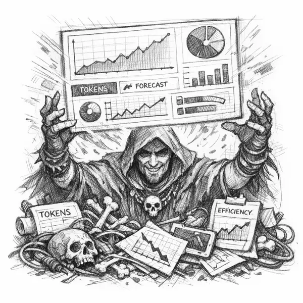
The Dashboard Necromancer produces the chart that lets a room believe the story it already wanted to believe. The dashboard may be sincere. It may even be helpful. But the Necromancer's real power is selection: the right metric, in the right deck, at the right moment, can support a project, cancel a project, or send everyone chasing a problem that barely exists.
Symptom
The dashboard shows spend over time with a projected trend line that looks like a ruler was applied to it. AI spend does not move in straight lines. A deck appears at exactly the right moment to support or cancel a project, and nobody can explain why this metric is the deciding one.
Why It Matters
The Necromancer has not silenced the room. They have given the room a story to repeat. The dashboard measures spend. It does not measure value. There is no column for 'what did this spend produce?' The Necromancer will say that value measurement is outside the scope of the FinOps function. That is true and also a problem.
What the Chapter Gives You
How to make assumptions explicit and visible, why every projection needs a 'what we don't know' column, and the question that turns a dashboard from a story into a tool.
Want the full chapter? Grab the free cheat sheet, read an excerpt, or get the book.
Recognize this one in your codebase?
Free cheat sheet, excerpts, and interactive diagnostics.